See your colours in use
Each colour selected with the tool gets its own card in the section on the right so you can see how the colours harmonise together.
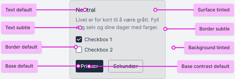
Note that the contrast colour inside the button changes from white to black, depending on whether the selected colour is light or dark, to achieve the best possible contrast.
accent
Colours make life more colourful
brand1
Colours make life more colourful
brand2
Colours make life more colourful
neutral
Colours make life more colourful
Color Tokens
Here you can see which tokens have been used to create the cards in the section above.
Contrasts between colours
Here are the contrasts between the different steps in the colour scales, and whether the colours meet WCAG requirements.
Text and background must have a contrast of at least 7:1 to meet the WCAG AAA requirement.
Text and background must have a contrast of at least 4.5:1 to meet the WCAG AA requirement.
Text and background must have a contrast of at least 3:1 and a font size of 18 px or larger to meet the WCAG AA requirement.
Does not meet any WCAG contrast requirements and should only be used for decorative purposes.
Text and Border against Background and Surface
When you switch between the color scales, you will see that the contrasts between the colors in the section below are almost identical. This means you only need to consider the contrasts for one color scale to understand how all of them work. Since the contrasts are consistent, you can also combine different colors across the scales.
Background Default #ffffff | Background Tinted #eef4fa | Surface Default #ffffff | Surface Tinted #ddeaf6 | Surface Hover #c7ddf0 | |
|---|---|---|---|---|---|
Border Subtle #99c0e3 | |||||
Border Default #2a7cc5 | |||||
Border Strong #005db1 | |||||
Text Subtle #005db1 | |||||
Text Default #002c54 |
Base colours
The colours selected in the tool get the Base Default token in each colour scale. This means it is important to choose a colour that has over 3:1 contrast against surface colours if it is to be used as an important, meaningful colour. The tool also creates two contrast colours that can be safely used on top of the base colours. These contrast colours become either light or dark depending on the base colour.
Background Default #ffffff | Background Tinted #eef4fa | Surface Default #ffffff | Contrast Subtle #dbe9f5 | Contrast Default #ffffff | |
|---|---|---|---|---|---|
Base Default #0062BA | |||||
Base Hover #004f96 | |||||
Base Active #003d75 |